
Bootstrap Web Design
What is Bootstrap & What Are the Benefits of Using Bootstrap?
Bootstrap is a powerful multipurpose and responsive open-source web development (HTML, CSS, and JavaScript) framework. Bootstrap provides a comprehensive set of syntax for template design that simplifies the process of creating web applications. It provides reusable code snippets written in HTML, CSS, and JavaScript for front-end developers and designers.
What is Bootstrap Web Design or Bootstrap Design
Bootstrap web design is the process of creating a website or web application using the Bootstrap framework for web design. This process involves using Bootstrap’s pre-built components including grids, typography, buttons, forms, navigation bars, tables, models, image carousels, as well as JavaScript plugins, and more to create attractive responsive designs. It provides a collection of ready-made components. Bootstrap streamlines a web design process and provides a consistent and user-friendly interface across different device full-screen sizes, simplifying customization and management. With Bootstrap, developers can easily create websites optimized for mobile devices. Bootstrap is a must-have tool for any web developer to build responsive websites.
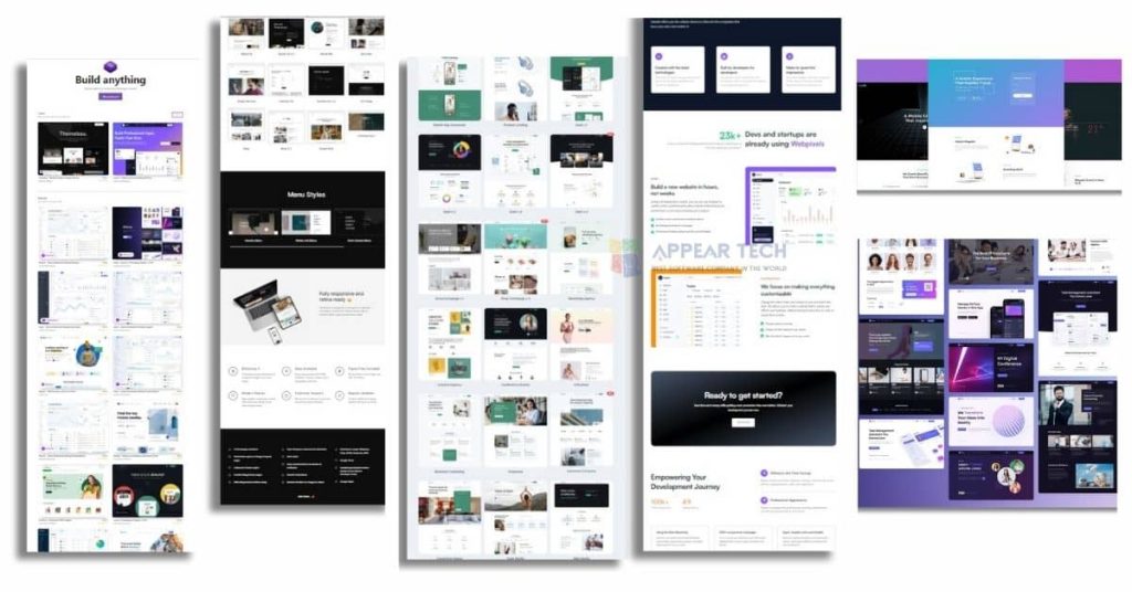
Here is some Bootstrap Design Template:
Bootstrap 5: The Essential Guide to Web Development
Official Bootstrap 5 is the latest version of the widely used and most popular CSS framework. Which simplifies the process of responsive web development. It enables developers to easily create mobile-first websites, and with its predefined grid system, developers can easily insert code into responsive designs.
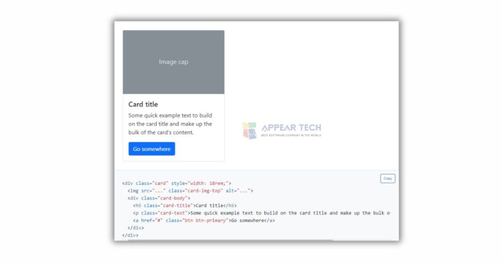
Bootstrap 5 Card:
Cards in Bootstrap provide a flexible and extensible content container.
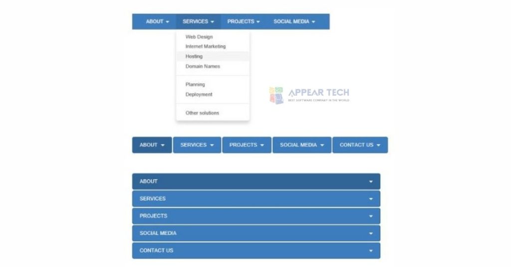
React-Bootstrap Navbar Stick to the Top of the Web Page
The Navigation Bar (navbar) is a versatile and flexible header that provides support for branding and navigation. To demonstrate its simplicity, the website includes a React Bootstrap navbar button with a React background color. To use the bootstrap navbar, first, take it from “react-bootstrap” and use the sticky=”top” attribute to fix the navbar to the top and have the option to customize the background color of the navbar using the “bg” attribute.
To implement a sticky navbar using React Bootstrap, you can use the `sticky=”top”` attribute on the `<Navbar>` component.
With this, you can create a basic react js navbar dropdown. Using this code, you will be able to create a Navbar that stays at the top of the page as the user scrolls. Feel free to customize the links and other content within the Navbar to meet your specific needs
Here is an example code snippet of react-bootstrap:
<nav class=”navbar navbar-inverse”>
<div class=”container-fluid”>
<div class=”navbar-header”>
<a class=”navbar-brand” href=”#”>WebSiteName</a>
</div>
<ul class=”nav navbar-nav”>
<li class=”active”><a href=”#”>Home</a></li>
<li><a href=”#”>Link</a></li>
<li><a href=”#”>Link</a></li>
</ul>
<button class=”btn btn-danger navbar-btn”>Button</button>
</div>
</nav>
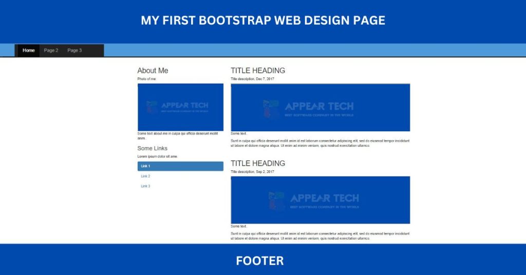
Why Should You Use Bootstrap Studio?
Bootstrap Studio is a privately owned web design and development application. It offers a wide range of components for creating responsive pages, including headers, footers, galleries, and slideshows, as well as basic elements like spans and divs. This program is ideal for building websites and prototypes. It has a comprehensive component library, a grid-based design system, custom CSS editing, and the ability to preview designs on different device sizes. Bootstrap Studio is a desktop application that is extremely useful for creating responsive websites using the Bootstrap framework. It has a drag-and-drop interface that enables users to visually design web pages without writing any code. Bootstrap Studio is a powerful tool that helps you create, customize, and export responsive web designs.
The Impact of a Bootstrap Company on Your Brand
“Appear Tech” is the best bootstrap company in Bangladesh. We have successfully completed 1000+ projects over 7+ years of Bootstrap Web Design. We have a heavy portfolio with satisfied clients. We specialize in website design and development (Bootstrap, HTML, CSS, PHP, JavaScript, Nodejs). Our a secret is shared with you, we maintain a proper Bootstrap design system when we work on Bootstrap website design. If you want to create a website for your business and website development using Bootstrap web design, you can contact us.
If you need our other services for your business purposes like Web Application Development, Bootstrap Web Development, Domain and Hosting Services, Professional SEO (Search Engine Optimization), UI/UX Design, Digital Marketing, Branding Social Media Marketing, Affiliate Marketing, PPC and Social Advertising, e-commerce web/app solutions, etc. Don’t hesitate to contact us and hire our professional and expert team with these platforms.
Frequently Asked Question About Bootstrap
Bootstrap is an open-source web application development framework. It involves typography, buttons, navigation bars, forms, tables, and many types of responsive web design.
Bootstrap MB5 Class or html – Bootstrap MB5 is a responsive margin or padding feature that supports element spacing.
Bootstrap is an open-source web application for web development that uses HTML elements and CSS properties. HTML5 doctype for this
is required. Developers can easily optimize for mobile devices with this. Bootstrap has so many features and functionality for creating responsive websites that every web developer constantly uses it as their core tools.
HTML is a hypertext markup language used to create webpages on a website.
And Bootstrap is an open source web development JavaScript and CSS library that makes web applications or webpages attractive and mobile friendly.
The class name used in Bootstrap to remove all padding from an element is .pe (.pe-1, .pe-2, .pe-3, .pe-4 ) which excludes padding and margins for classes set to 0 – 0 .


Wonderful beat I wish to apprentice while you amend your web site how could i subscribe for a blog web site The account aided me a acceptable deal I had been a little bit acquainted of this your broadcast provided bright clear idea
I was suggested this web site by my cousin Im not sure whether this post is written by him as no one else know such detailed about my trouble You are incredible Thanks